Rab Veil 12
The mission is to develop compelling marketing materials for the "Veil 12" running vest, enhancing the product's branding with a cohesive logo. This project will encompass the creation of social media graphics, a one-page print design, and an engaging email layout. The goal was to effectively communicate the vest's features and appeal to our target audience, reinforcing the brand identity and increasing visibility across various platforms.
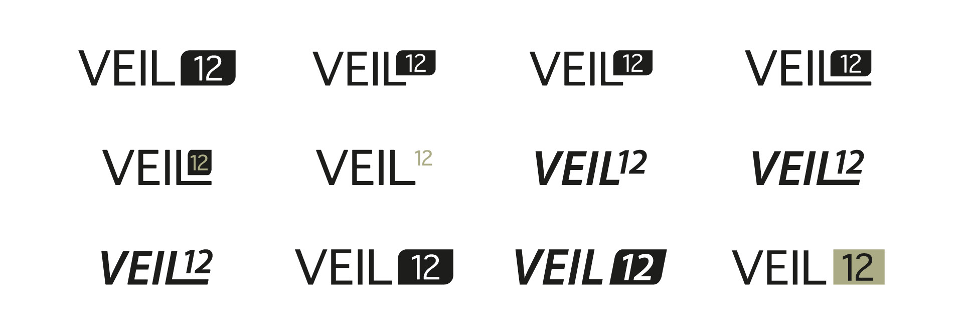
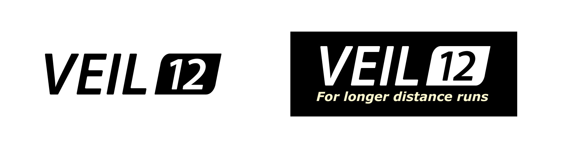
I initiated the design project by creating a new logo for the Veil 12 that aligns seamlessly with the Rab branding. The inspiration for this design was drawn from the existing logo on the side of the product. I opted for an italic font to evoke a sense of movement and speed, reflecting the dynamic nature of the running vest.
To enhance the design, I incorporated a light yellow in the tagline, providing distinction and continuity while effectively highlighting key elements throughout the materials.
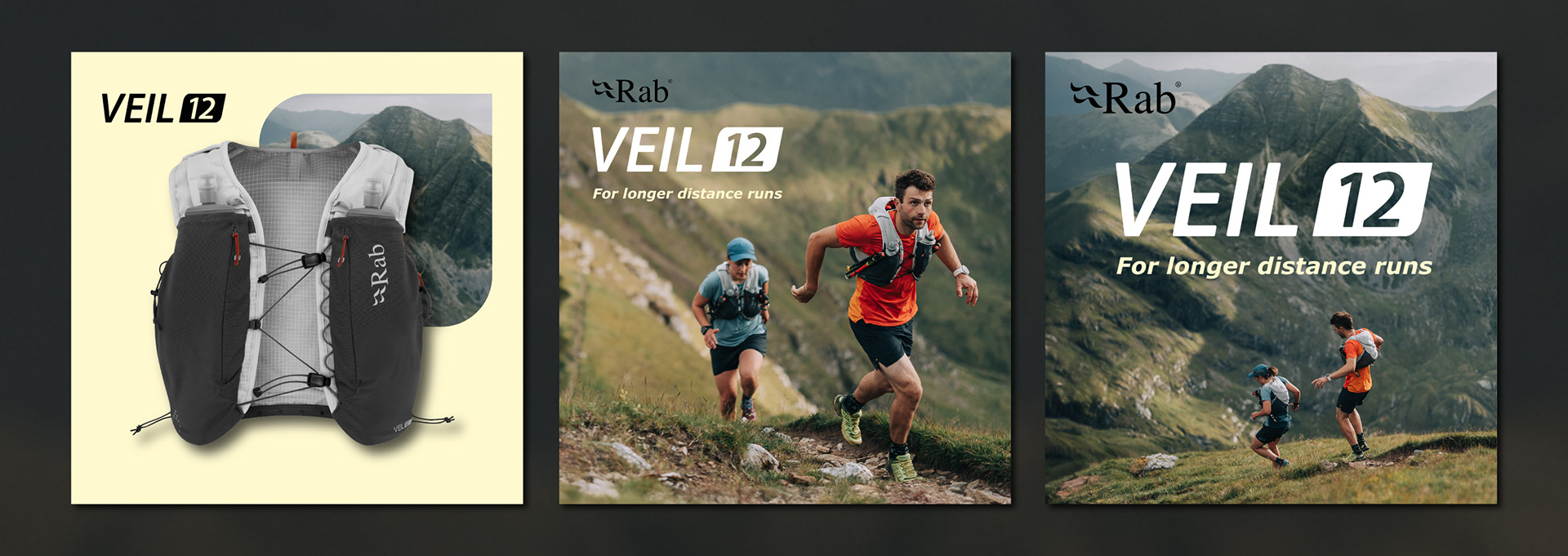
These social media graphic designs feature the Rab and Veil 12 logos, ensuring viewers instantly recognise the product’s association with the brand. The tagline utilises the same light yellow colour to maintain branding consistency and reinforce branding.
The first design showcases the product against a boxed background, effectively conveying its intended use for adventurous long runs. This visual emphasises the rugged and dynamic nature of the Veil 12, appealing to our target audience.
These versatile designs can be used either as a carousel or as standalone posts.

The above image is designed for paid digital marketing in a landscape format. It features a striking photo of Rab athletes, creating a direct connection with the viewer. The crop focuses on the athletes, simplifying the natural composition and drawing attention to their expressions and energy.
An opaque box in a dark colour complements the product and aligns with the Rab logo, enhancing the product's visibility and ensuring it stands out prominently against the background.
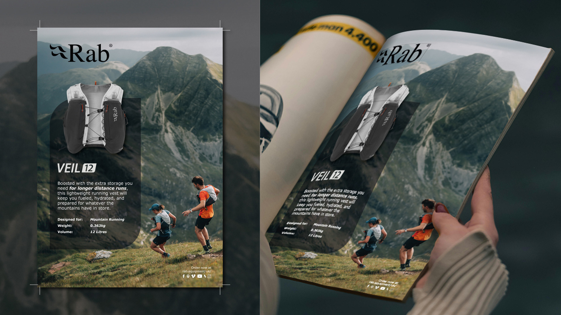
This single-page design is crafted for magazine use and includes a 3mm bleed and trim marks. The layout prioritises photography, taking advantage of the natural composition offered by the landscape.
I selected this particular photo of athletes running toward the mountains to evoke a sense of adventure and intrigue for the viewer. This dynamic imagery not only captures the essence of the Veil 12 but also inspires a spirit of exploration.
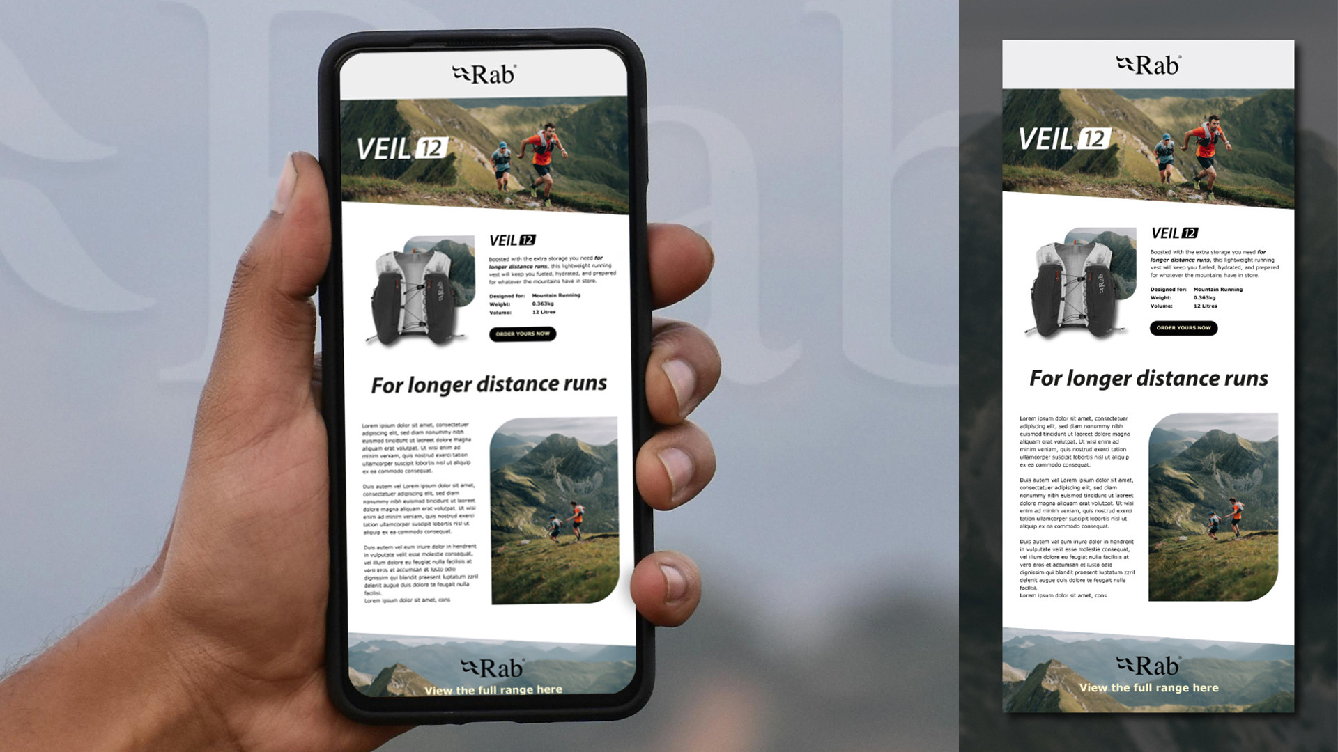
The email design emphasises product photography, ensuring ample space around each element for easy readability. The clean layout allows viewers to fully appreciate the photography and design components.
A diagonal line at the bottom creates visual interest and enhances the overall design. The header features only a photo and the logo, providing a clear focus on the email's main message. The product is showcased with a square background photo, effectively conveying its intended use.
A subtle yellow hue in the call to action draws attention to the order link, encouraging engagement. The tagline positioned between sections adds visual balance and maintains an airy layout. There is an informational section that offers additional details while reinforcing branding, incorporating rounded corners that echo the Veil 12 logo. Finally, the second call to action ties the layout together, following the diagonal line from the top. It utilises a cropped section of the photo to ensure legibility while maintaining visual appeal.